
前言
前面已经介绍了shinydashboard框架的标题栏和侧边栏的输入项部分,这节介绍一下侧边栏的菜单项(menu items),侧边栏的菜单项主要用于切换不同的主体界面,点击不同的菜单项,主体呈现出不同的界面内容。 【R语言】shinydashboard系列一:标题栏
【R语言】shinydashboard系列二:侧边栏–输入项
菜单项menu items
菜单项分类
侧边栏的菜单项可以分为静态菜单项和动态菜单项,注意这里说的静态和动态说的是书写代码的时候,而不是对于呈现的结果。静态菜单项用到两个函数:sidebarMenu()和tabItems(),动态菜单项用到上一节讲到的一对输出函数:sidebarMenuOutput()和renderMenu()。
注意
静态菜单项:sidebarMenu()函数写在ui脚本dashboardSidebar()中,tabItems()函数写在dashboardBody()中;动态菜单项:输出项sidebarMenuOutput()函数写在ui脚本dashboardSidebar()中,renderMenu()函数写在server脚本中与之对应。
静态菜单项
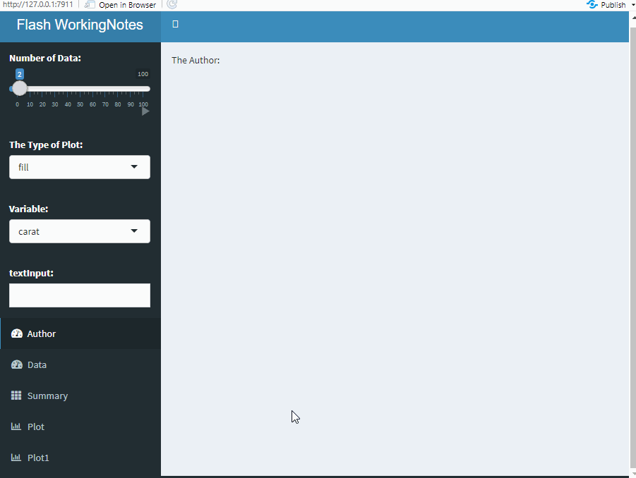
静态菜单项主要用到两个函数:sidebarMenu()和tabItems(),sidebarMenu()函数写在dashboardSidebar()函数中,tabItems()函数写在dashboardBody()中,两种通过tabName相互对应。例如:
library(shiny)
library(shinydashboard)
library(ggplot2)
library(DT)
ui <- dashboardPage(
dashboardHeader(title = "Flash WorkingNotes"),
dashboardSidebar(
sidebarMenu(
menuItem("Data", tabName = "Data", icon = icon("dashboard")),
menuItem("Summary", tabName = "Summary",icon = icon("th"), badgeColor = "green"),
menuItem("Plot", tabName = "Plot", icon = icon("bar-chart-o")),
menuItem("Plot1", tabName = "Plot1", icon = icon("bar-chart-o"))
)),
dashboardBody(
tabItems(
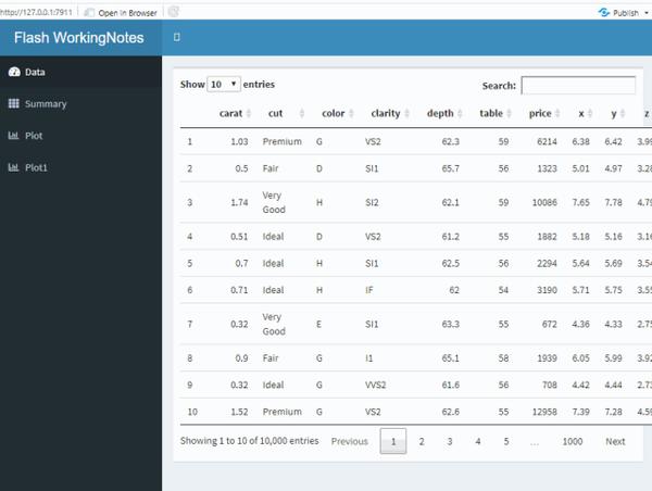
tabItem(tabName = "Data", box(dataTableOutput("Data"), width = 100)),
tabItem(tabName = "Summary",verbatimTextOutput("Summary")),
tabItem(tabName = "Plot", plotOutput("Plot")),
tabItem(tabName = "Plot1",plotOutput("Plot1")))
)
)
server <- function(input, output) {
set.seed(123)
data = diamonds[sample(1:nrow(diamonds), 10000, replace = F), ]
output$Data <- renderDataTable({datatable(data)})
output$Summary <- renderPrint({str(data)})
output$Plot <- renderPlot({
ggplot(data, aes(x = price, fill = cut)) +
geom_histogram(position = "fill", bins = 30) +
ggtitle("histogram plot") +
theme(plot.title = element_text(hjust = 0.5)) + xlab("")
})
output$Plot1 <- renderPlot({
ggplot(data = data, aes(x = carat, y = price, colour = color)) +
geom_point() + ggtitle("scatter diagram") +
theme(plot.title = element_text(hjust = 0.5))
})
}
shinyApp(ui, server)
注意上面sidebarMenu()和tabItems()书写位置,sidebarMenu()中的menuItem与tabItems()中的tabItem成对出现,通过tabname一一对应。
上面4个菜单项:Data菜单项呈现原数据,Summary菜单项查看数据字段类型,Plot菜单项绘制直方图,Plot1菜单项绘制散点图。上述代码运行结果:
动态菜单项
动态菜单项通过sidebarMenuOutput()和renderMenu()实现。sidebarMenuOutput()写在ui中的dashboardSidebar()中,renderMenu()写在server中与之对应,两者通过变量名匹配。
library(shiny)
library(shinydashboard)
library(ggplot2)
library(DT)

ui <- dashboardPage(
  dashboardHeader(title = "Flash WorkingNotes"),
  dashboardSidebar(sidebarMenuOutput("menu")),
  dashboardBody(
    tabItems(
    tabItem(tabName = "Data", box(dataTableOutput("Data"), width = 100)),
    tabItem(tabName = "Summary",verbatimTextOutput("Summary")),
    tabItem(tabName = "Plot", plotOutput("Plot")),
    tabItem(tabName = "Plot1",plotOutput("Plot1"))))
)

server <- function(input, output) {
  set.seed(123)
  data = diamonds[sample(1:nrow(diamonds), 10000, replace = F), ]
  output$menu <- renderMenu({
    sidebarMenu(
      menuItem("Data", tabName = "Data", icon = icon("dashboard")),
      menuItem("Summary", icon = icon("th"), tabName = "Summary",badgeColor = "green"),
      menuItem("Plot", tabName = "Plot", icon = icon("bar-chart-o")),
      menuItem("Plot1", tabName = "Plot1", icon = icon("bar-chart-o"))
    )
  })
  output$Author <- renderText({paste("The Author:", input$text)})
  output$Data <- renderDataTable({datatable(data)})
  output$Summary <- renderPrint({str(data)})
  output$Plot <- renderPlot({
    ggplot(data, aes(x = price, fill = cut)) +
      geom_histogram(position = "fill", bins = 30) +
      ggtitle("histogram plot") +
      theme(plot.title = element_text(hjust = 0.5)) + xlab("")
  })
  output$Plot1 <- renderPlot({
    ggplot(data = data, aes(x = carat, y = price, colour = color)) +
      geom_point() +  ggtitle("scatter diagram") +
      theme(plot.title = element_text(hjust = 0.5))
  })
}
shinyApp(ui, server)
注意上面sidebarMenuOutput()和renderMenu()的书写位置,两者通过menu变量名匹配。
总结
将侧边栏的输入项和菜单项介绍完整。菜单项用于切换主体呈现的界面,输入项用于改变主体呈现的内容,书写代码的时候菜单项有静态菜单项和动态菜单项。重点注意菜单项和输入项以及对应的输出项函数的书写位置,即可灵活使用。最后上传一下文章开头动态图的代码。
library(shiny)
library(shinydashboard)
library(ggplot2)
library(DT)
ui <- dashboardPage(
  dashboardHeader(title = "Flash WorkingNotes"),
  dashboardSidebar(
    sidebarMenu(
      menuItem("Data", tabName = "Data", icon = icon("dashboard")),
      menuItem("Summary", icon = icon("th"), tabName = "Summary",badgeColor = "green"),
      menuItem("Plot", tabName = "Plot", icon = icon("bar-chart-o")),
      menuItem("Plot1", tabName = "Plot1", icon = icon("bar-chart-o"))
    )),
  dashboardBody(
    tabItems(
      tabItem(tabName = "Data", box(dataTableOutput("Data"), width = 100)),
      tabItem(tabName = "Summary",verbatimTextOutput("Summary")),
      tabItem(tabName = "Plot", plotOutput("Plot")),
      tabItem(tabName = "Plot1",plotOutput("Plot1")))
  )
)

server <- function(input, output) {
  set.seed(123)
  data = diamonds[sample(1:nrow(diamonds), 10000, replace = F), ]
  output$Author <- renderText({paste("The Author:", input$text)})
  output$Data <- renderDataTable({datatable(data)})
  output$Summary <- renderPrint({str(data)})
  output$Plot <- renderPlot({
    ggplot(data, aes(x = price, fill = cut)) +
      geom_histogram(position = "fill", bins = 30) +
      ggtitle("histogram plot") +
      theme(plot.title = element_text(hjust = 0.5)) + xlab("")
  })
  output$Plot1 <- renderPlot({
    ggplot(data = data, aes(x = carat, y = price, colour = color)) +
      geom_point() +  ggtitle("scatter diagram") +
      theme(plot.title = element_text(hjust = 0.5))
  })
}
shinyApp(ui, server)